Identity
The wordmark sets the system: a hand-painted "my" sitting next to a bold geometric "Gig". Human grit meets confident systems.
Use on light backgrounds. Clear space = cap-height of "G" on all sides. Never distort, recolour, or drop-shadow.
White version on dark backgrounds. Never place on busy photography without a solid ink block behind it.
 64px
44px
32px
64px
44px
32px
Square mark for app icons, favicons, tight-space contexts. Never stack mark + wordmark together.
Always lowercase "your". Permanent Marker typeface. Hero shots and campaign layouts only — never in buttons, navigation, or product chrome.
Voice & Tone
Plain-spoken, confident, Aussie-flavoured. Competent operations manager who genuinely respects the worker on the floor. Not corporate HR-speak. Not Silicon-Valley breezy.
| Surface | Tone | Example |
|---|---|---|
| Marketing — Business | Confident, evidence-led | "90%+ fill rate. Industry average is 65%." |
| Marketing — Worker | Empowering, freedom-first | "Work shifts that work for you." |
| Business platform | Operational, calm | "3 of 5 positions confirmed for Saturday." |
| Worker app | Friendly, motivating | "Great shift, Sarah! $156.80 earned." |
| Notifications | Brief, actionable | "Shift starts in 2 hrs — tap to confirm." |
Always sentence case for UI labels. Active voice, present tense. Concrete > clever. Numbers are the brand's superpower.
Lead with these numbers. "90%+ fill rate. Industry average is 65%." — always show the comparison.
Colours
Three commitments: INK (off-black neutrals), BRAND (signature violet — pulled from mygig.com.au), PAPER (warm off-white). All tokens in project/colors_and_type.css.
Never use pure #000. The brand black is #0E0D0B — it has warmth.
Used confidently — not sparingly — because it IS the brand colour. White text reads cleanly on brand-500 and above. Focus outlines use brand-500.
Deliberately less saturated than brand violet so they don't fight for attention. The brand colour carries weight; semantics are utility.
Pastels keep brand violet as the only saturated brand colour on screen. Never use tag tints as page chrome or section backgrounds.
Typography
Three voices mirror the wordmark composition. All four families are free, open-source (Google Fonts / SIL OFL), loaded from fonts.googleapis.com.
60 seconds.
The "Gig" voice. Heavy, geometric, slightly humanist — a strong companion to the wordmark's "Gig". Use for all headlines, big numbers, hero copy.
The utility voice. Open and legible at small sizes. Use for paragraphs, UI labels, forms, data. Sentence case for all UI labels.
The brushed "my" nod. Used SPARINGLY — pull-quotes, hero callouts, the tagline. Never in buttons, navigation, or product chrome.
Anything monospaced — shift IDs, timestamps, payslip line items. Never for prose or marketing copy.
Spacing
Everything snaps to a 4px grid. Tokens --sp-1 (4px) through --sp-24 (96px). Standard card padding is --sp-6 (24px).
--sp-1
--sp-2
--sp-3
--sp-4
--sp-5
--sp-6
--sp-8
--sp-10
--sp-12
--sp-16
--sp-20
--sp-24
Layout gutters: 48px marketing · 24px business platform · 16px worker app. Max widths: 1320px marketing · 1140px business · mobile-first 390px worker.
Shape & Elevation
Friendly radii — never zero. Pills used heavily for shift status and category tags. Shadows use warm ink tones, never blue.
4px
8px
12px
default
18px
28px
sheets
999px
tags/pills
Default for cards, inputs, buttons is --r-md (12px). Pills are a brand signature — used heavily for shift status, category chips. Never zero radius.
Cards at rest
Hover / active
Dropdowns
Modals
Inky and subtle. We don't tint shadows blue or purple. Shadows use rgba(14, 13, 11, …) — warm ink tone.
Hard offset drop — feels like a job site sign / parking permit. Used on the primary CTA button, hero badges, compliance callouts. Once per screen, max.
Border widths: --bw-hair: 1px dividers · --bw-rule: 1.5px inputs · --bw-heavy: 2px selected · --bw-stamp: 3px stamp motif only.
Buttons
Primary CTA uses the stamp motif — brand violet fill, 3px ink border, 4px hard offset shadow. Press translates 2px to "push the button down".
Hover: lift −1px, shadow grows. Active/Press: translate +2px, shadow shrinks to 1px. Focus: 2px brand-500 outline, 2px offset. Disabled: opacity 0.45, no grey fill.
Inputs
1.5px border at rest, 2px brand-violet border + 3px brand-tint glow on focus. Never use default blue focus rings.
Status Pills
Pills are a brand signature — border-radius: var(--r-pill). Used for shift state, cert status, worker tier.
"Open shift" uses brand-100 background with brand-700 dot — the violet signals availability without alarm. "Top worker" uses ink-900 on dark for prestige.
Worker Chip
Avatar (photo or initials) + name + secondary info. Used in shift confirmations, the business pool view, and Amy's suggestions.
Use profile photo when available. Fallback is initials on an industry tag tint — randomly assigned but consistent per worker. 1.5px ink border on avatar circle.
Shift Card
The atomic unit of the product. Every worker-facing screen revolves around this. Industry tag, position, location, time, estimated earnings, and one brand-violet CTA.
Money in AUD, always with cents. Time in 12-hour local, lowercase am/pm. Industry tint chip — never used elsewhere on the same screen. One stamp CTA.
Stamp Motif
A deliberate brand moment. Feels like a job-site sign / parking permit. Used on primary CTAs, hero badges, compliance callouts. Once per screen, max.
CSS: background: var(--brand-500); border: 3px solid var(--ink-900); box-shadow: 4px 4px 0 var(--ink-900); — never use on more than one element per screen.
Toggles & Forms
Toggle on = brand violet. Checkbox checked = brand violet fill with ink border. Segmented control active = ink-900.
Amy — the AI assistant
Amy is MyGig's AI assistant. She lives in the Business platform and handles workforce work end-to-end. She proposes; the user disposes. Never auto-acts without explicit confirm.
Radial-gradient orb — never a stock robot icon, never a human-style avatar. The spark glyph ✦ is Amy's signature — use as a bullet in front of AI-generated suggestions.
✦ Your Thursday lunch shift (Single O, 10am–3pm) has 0 workers confirmed with 30 hrs to go. I found 3 workers in your pool — want me to invite them?
Open with action. Show, don't tell — Amy generates an artifact, not a wall of text. One-click out — every response has a primary CTA and ghost "Edit". Always cite the basis.
Iconography
Lucide — open source, stroke-based, comprehensive workforce/calendar/payment coverage. 1.75–2px stroke weight. Sizes 16, 20, 24px.
Colour: --ink-700 primary · --ink-400 secondary · --brand-700 active nav. Load via lucide-react or unpkg.com/lucide-static. Never rotate or skew icons for effect.
States & Motion
Default: 200ms ease-out-quint. Fast: 120ms for hover/press. Slow: 400ms for full-screen sheets. No bounce animations in business UI.
| State | Treatment |
|---|---|
| Hover | Background steps one shade darker (e.g. ink-50→ink-100). Stamp CTAs lift translate(-1px,-1px), shadow grows to 5px. |
| Press / active | Stamp CTAs: translate(2px,2px), shadow shrinks to 1px — feels like pressing a real button. Other buttons: --brand-700 fill. |
| Focus (keyboard) | outline: 2px solid var(--brand-500); outline-offset: 2px; — never default browser blue. Applies to all interactive elements. |
| Disabled | opacity: 0.45. No grey fill swap — we don't pretend it's clickable. |
| Loading | Pulsing shimmer on 1.2s loop, ink-50→ink-100. No spinners except worker mobile pull-to-refresh. |
Easing: cubic-bezier(0.22, 1, 0.36, 1) (ease-out-quint). Page transitions: slide up + fade for mobile bottom sheets; fade only for desktop modals.
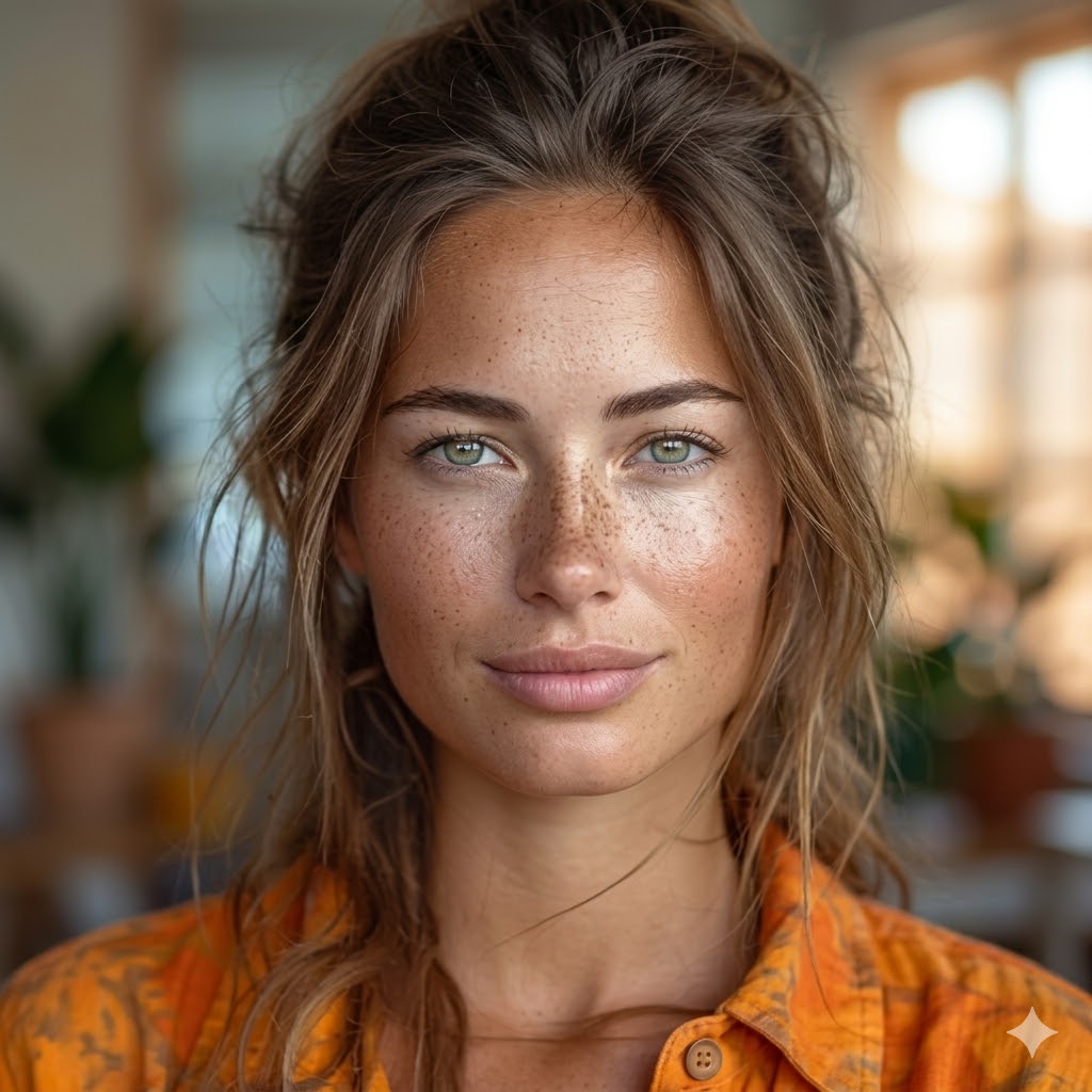
Imagery
Real workers. Real worksites. Documentary-feeling. Natural light, warm tones. Eyes on the work, not the camera. Never cold blue tech lighting, never staged stock.
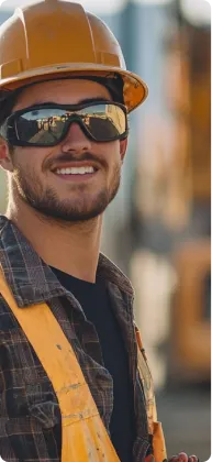 Construction
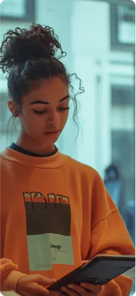 Retail
 Hospitality
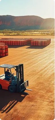 Mining
 Portrait
 Agriculture
Signature pattern: vertical portrait cards (4:5 ratio), one per industry, lined up under the headline. Corners --r-md (12px). Three cards rotated at +3°, −2°, straight for the hero stack. Always include one ink-900 card in the mix.
| Rule | Guideline |
|---|---|
| Subject | Workers mid-task. Eyes on the work. Aprons, hard hats, hi-vis gear, forklifts, espresso bars, retail floors. |
| Light | Natural, warm. Golden hour, daylight through windows, kitchen tungsten. Never cold blue tech lighting. |
| Mood | Documentary, not staged. Saturation 0.85–1.0. Subtle grain ok. No filters. |
| Diversity | Represent Australia's casual workforce honestly. Age, gender, ethnicity — all real, all on the floor. |
| Placeholder | Solid ink-900 block at intended dimensions with a brand-300 corner label naming the planned shot. Never AI-generated fake worker photography. |
Assembled screens
Full-fidelity HTML prototypes for each surface. Open in a browser — no build step required.